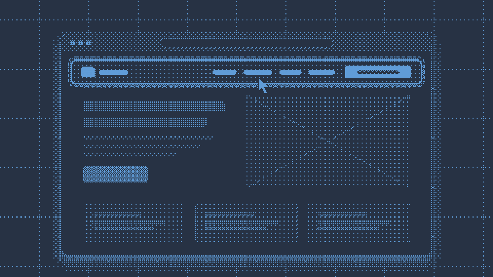
Landing page without a menu: why it can be a mistake for a small business
Removing the menu from a landing page is common advice, but the tests behind it come from brands people already know. Why a small business risks losing leads, and what Google Ads says.

Davide Ruggeri
It happens to me often when I google the name of a piece of software. The first result is sponsored, I click it and end up on a landing page with a headline, a form and nothing else. No menu, no link to pricing, documentation or login. I just wanted to understand what it was and whether it was for me, and the only thing I could do was leave my email. I go back and click the result below.
It annoys me every time. And yet removing the menu from a landing page is one of the most repeated pieces of advice in marketing: fewer links, fewer distractions, more conversions.
I went to see what that rule rests on. The data is there and it’s real. The point is who it comes from.
Where the rule of removing the menu comes from
The idea behind it is the attention ratio, popularised by Oli Gardner of Unbounce: the ratio between the things a visitor can do on a page and the things you want them to do. A page with a menu, footer and social icons easily reaches 20 to 1. A landing page, according to this theory, should be 1 to 1: one form, one button. Every extra link is an exit.
The case everyone cites is Yuppiechef, a South African e-commerce store that tested its wedding registry page with and without a navigation bar. Without the menu the sign-up rate went from 3 to 6%.
The tests that circulate come from companies you already know
The most serious test I found is from HubSpot, told by Diana Urban. They took five of their highest-traffic landing pages and removed every link: menu, footer and social sharing.
- on the three landing pages offering free content in exchange for an email, the conversion rate rose between 0 and 4%
- on the two asking for one more step, a software trial and contact with sales, the increase was 16 and 28%
These are real numbers and I don’t dispute them. But look at who produced them. Someone landing on a HubSpot page already knows who HubSpot is: they don’t need a menu to understand whether there’s a serious company behind the page. The brand did that work before the click.
There’s another filter too. The case studies that end up online are the ones that went well. Fahad Muhammad, in a roundup for CXL, lines up quite a few navigation tests: all of them show an improvement after removing it. Whoever removed the menu and lost leads didn’t write an article about it.
A small business first has to be verified
That work done in advance by the brand is something a small business doesn’t have. Someone who clicks an ad and lands on the page of a studio they’ve never heard of has one question before all the others: who are these people? They want to see who is behind it, what they’ve done, whether they really exist. The menu is the quickest way to find out. If you take it away, they have only one move left to verify you: go back.
Lilach Bullock, a marketing consultant, describes the choice as a trade-off between focus and trust, depending on who lands on the page and how much you ask of them. An email to download a checklist is a small request, and there the menu can go. A consultation or a demo is a big request, and whoever receives it wants to be able to find out more first.
A landing page asking you to book a call with an unknown studio is entirely in the second case.
A counter-example exists. Also in the CXL roundup there’s AmeriFirst, which feared losing customers’ trust, removed the navigation anyway and saw conversions rise by 30-40%. Mine is a line of reasoning, not a law. But it’s the same reasoning I use when I’m on the other side of the screen, and I’ve seen it confirmed with a client.
What happened with Italian Teacher
Italian Teacher sells private online Italian lessons to Dutch and English-speaking students. It isn’t a platform like Preply: it’s a teacher with a small team, asking a stranger to book a trial lesson and then buy a package worth hundreds of euros. A big request, from someone nobody knows.
The Google Ads campaigns initially led to the home page. The first attempt was a landing page without a menu, with more or less the same structure and the same text as the previous page. Conversions dropped. People wanted to navigate: to understand who was behind it before leaving their details.
The second attempt changed the text and put the menu back. The headline repeated the promise of the ad, the trial lesson was on the first screen and the page talked about the student before the school. At the top, the menu with about us, courses, blog and contact. The campaigns’ conversion rate doubled.
It’s not a clean A/B test. Volumes were small and the text changed in the second round too. But the comparison I care about is in the first: same text, no menu, worse result. In the body of the page there is a single action, booking the trial lesson. The menu stayed, and that’s where someone who doesn’t trust you yet goes to check.
And for almost two years Google has thought the same.
Google Ads now rewards navigable landing pages
In February 2025 Google announced a new model that evaluates the navigation of search ad landing pages. The phrase it used, reported by Search Engine Journal, is blunt: landing pages must be “both relevant and easy to navigate”. The example Search Engine Journal gives is the ad that promises a login and leads to a promotional page. It’s the same scene I started from.
Greg Finn of Cypress North wrote a piece with a telling title, the end of navigation-less landing pages in Google Ads. According to him, pages with no way out risk being shown less. He doesn’t recommend bringing back the whole site menu: links to the home page and the main sections are enough.
How much navigation weighs on the quality score is still unclear, as Finn himself admits. But if you advertise on Google, removing the menu might gain you a few conversions and at the same time cost you visibility.
The menu is the last thing I’d remove, not the first.
If you’re working on your site and want to talk about it, tell me about your project.