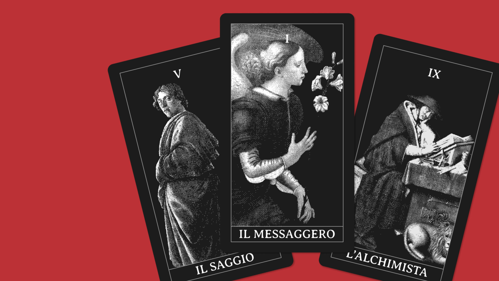
Types of websites: the six archetypes, with a famous example for each
Before the shape, what matters is the job the site has to do. Six archetypes, from the Messenger to the Alchemist, each with a one-line definition and a well-known site that embodies it.

Davide Ruggeri
· Updated October 15, 2026People who need a website usually start from the form: how many pages, what style. Those are fair questions, but they don’t say what job the site has to do once it’s live, and almost everything else depends on that job. To give it a name I’ve put together six archetypes, six characters a website can have when it does its work well, each with a one-line definition and a well-known site that embodies it.
If you want to get straight to the answer, I’ve built a free archetype test: five questions about your business, no technical jargon, and at the end you’ll know your site’s archetype and the first step to take.
The six archetypes in one line
The Messenger is a page that tells people arriving from an ad or a post one thing, and asks them to do one thing.
The Witness is the site people open after hearing your name, to find out whether they can trust you.
The Ambassador is the site that speaks for you to the people who have to decide and have never met you.
The Merchant is the site that gets found by people already looking for what you sell.
The Sage is the site that answers people’s questions before they know what to buy.
The Alchemist is the site where someone looking at a product buys it without going anywhere else.
I borrow the word archetype from Jung, for whom a figure is recognized by what it does in the story, not by how it looks. The same goes for websites: two sites with the same design can have different archetypes, and two sites that look nothing alike can share one. To figure out which one you have, you need to ask who arrives and what has to happen next.
If you’ve read the article on landing pages, brochure sites and content sites, you’ll recognize the three levels: the Messenger sits on the first, the Witness and the Ambassador on the second, the Merchant and the Sage on the third. The Alchemist squeezes them all into a single page.
The Messenger: the page that says one thing

The Messenger doesn’t live on search. Someone brings people to it (an ad, a video, a newsletter, a friend passing along the link) and it has a few seconds to get them to do one thing. No menu, no other pages to get lost in.
The most studied example is the pre-launch of Harry’s, the American razor brand. Before the online store existed, the founders set up a two-page microsite: the first collected an email address, the second gave each subscriber a personal link to share with friends in exchange for free products. In one week they got nearly one hundred thousand addresses, and 77% came from referrals by other subscribers. They published the full story, with the email templates and the code, on Tim Ferriss’s blog in 2014.
The traffic started from the personal emails of employees and their friends. The page didn’t need to be found by anyone: it just needed not to waste the people who landed on it.
You can spot a Messenger this way: if you switch off the channel that feeds it, nobody finds it anymore. That isn’t a flaw, it’s its job.
For the same reason, it’s judged by cost per lead, not by visits. For an Italian language school I work with, with the same ads and the same budget, changing only the landing page took the campaign’s conversion rate from 1.03% to 2.00%.
The Witness: the site that confirms who you are

Someone mentioned your name at dinner, or one of your messages reached a potential client’s inbox. That person looks you up, opens the site and decides within thirty seconds whether it’s worth replying. The Witness works in those thirty seconds, and it leaves almost no trace in the analytics: the site seems useless, while it’s actually deciding which leads survive.
The extreme example is berkshirehathaway.com. Warren Buffett’s holding company had more than $370 billion in revenue in 2025, and its website is a white page with a list of links and PDFs, plain HTML with no stylesheets, almost unchanged since the late nineties. Nobody lands there by accident. Whoever opens it already knows what Berkshire is and is looking for a shareholder letter or an annual report: the site only has to confirm it’s the official source, and it does that perfectly.
The case is useful precisely because it’s extreme. Berkshire can afford a bare Witness because the name already does all the work. If you’re still building your name, the site has to carry the proof the name doesn’t bring along: who you work for, with what results, who’s behind the business and what working together looks like.
The Ambassador: the site that talks to people you’ve never met
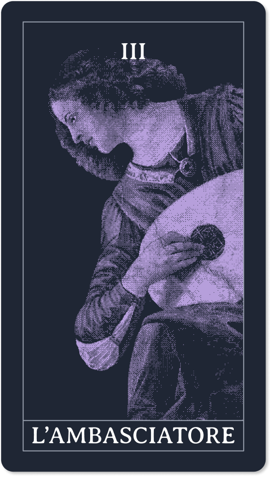
The Ambassador is a Witness with a tougher audience. The person you convinced on the call isn’t the one who signs. Between the call and the decision, your name travels through internal chats, ends up in a meeting you’re not invited to and gets placed next to two other quotes.
Gartner measured how much room is left for the seller. In B2B sales, buyers spend just 17% of their buying time talking to suppliers, and if they’re evaluating more than one, each gets 5 or 6%. For a complex solution the buying group typically numbers six to ten people, and they spend the rest of the time researching on their own and discussing internally.
Stripe is a good example of how an Ambassador is built. Whoever picks a payment system is usually a developer, but whoever approves the spend is a technical lead or a CFO. Stripe’s documentation has been considered the industry benchmark for years, and James Allgrove, from the company’s sales team, has written that the only thing that convinces a developer is experiencing the product’s value firsthand. The way I see it, the site is built so that this experience can happen without a salesperson, and can then be passed along, as a link, to whoever has to say yes.
The Merchant: the site that gets found by people who already know what they want
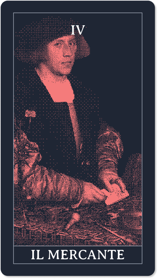
The Merchant answers people who have already put a name to what they’re looking for and are comparing stalls. It doesn’t need to explain the problem: it needs to show it has the right thing, using the same words people use to search for it.
Zapier turned this into a system. The service connects different apps, but almost nobody searches for “Zapier”: people search for how to connect Gmail to Slack, or Trello to Google Sheets. So the site has a page for every supported app and one for every pair, with a URL that always follows the same pattern (zapier.com/apps/slack/integrations/gmail, for example). There are tens of thousands of pages, and each one answers a precise search with the connection ready to switch on.
For a small business the scale changes, the logic doesn’t: one page for each thing you sell, written in your customers’ words rather than the ones used in the office. On an eye clinic I worked with, at the same Google ranking, the local commercial pages got five times the clicks of the informational ones. The Merchant’s most common mistake is putting everything on a single “services” page that tries to cover six things and gets found for none.
The Sage: the site that teaches before it sells
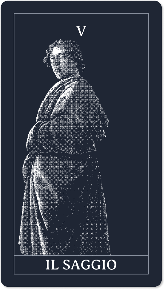
The Sage speaks to people who have a problem and don’t yet know a solution like yours exists. They aren’t looking for a supplier, they’re looking for an answer, and whoever gives it to them first, honestly, becomes the one they ask later too. To tell whether you need the Sage or the Merchant, one question is enough, which I developed while writing about when a blog is worth it for SEO: are the people who might buy from you already searching for what you sell, or only for the problem you solve?
The clearest example I know doesn’t come from tech but from swimming pools. River Pools and Spas installs fiberglass pools in the United States, and in the 2008 crisis it came close to going under because families could no longer finance the purchase. Marcus Sheridan, one of the partners, had no money for advertising. He took every question customers had asked him over the years and started answering them on the blog, one per article, including the ones competitors avoided, starting with price. In 2013 the New York Times told his story and reported that a single article on the cost of a pool had generated at least $1.7 million in tracked sales.
The Sage is the slowest archetype to get going: it’s measured in months, and it stops working when you stop writing. Sheridan shows, though, that the industry matters little. What matters is having someone who knows customers’ questions by heart and wants to answer them, which an article generator left running on its own can’t do.
The Alchemist: the site where you look and buy
In the other five archetypes the sale closes off the site, with a phone call or a quote. In the Alchemist it closes right there, and the product page has to do everything on its own: get found, clear up doubts and take the money.
Amazon is the Alchemist by definition, and the detail that tells the story best is a patent. In 1999 the company was granted a US patent on one-click purchasing: address and card saved once, then a single button does it. A month later it sued Barnes & Noble, which had added a similar option to its own site, and Apple chose to pay for a license. The patent expired in 2017. A company defending a button in court tells you how much every step removed between wanting to buy and paying is worth to an Alchemist.
For a small online store the principle is the same. Ads lead to the product page, not the homepage, and everything needed to decide (shipping, returns, reviews) is right there, next to the button.
If you still don’t know which of these characters your site needs, the free archetype test will tell you in five questions, along with the first step to take, written for your case.